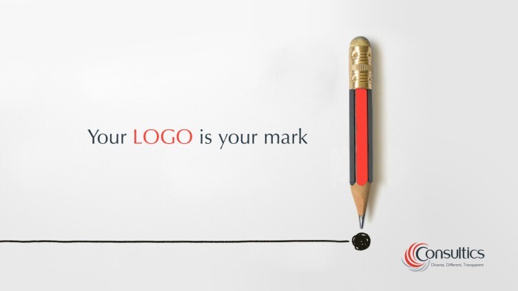
A logo is the face of your brand. It is your mark on the market and it represents the personality and values of your company.
So, in a very neatly designed nutshell, your logo reflects how you want your company to communicate with your audience, its personal approach towards customers and the market, and the essence of what makes your company stand out.
But how can so much depend on a simple graphic and how can you fit so much into one picture?
Before you approach a professional company specializing in making your logo the stamp that will cement your brand as a serious player in the market, consider the following.
What concept do you want your logo to represent? Every company has a concept it lives by, and this concept should live in your logo. It does not have to show what you sell, or what you do, or even be slightly associated with your market sector.
It has to bring the spirit of your company to the forefront.
Do you want to show you get things done, do you want to show you ooze success that will seep into your customers, do you want to tell your consumers they can ‘just do it’ and win the race?
Surely some logos just came to mind. These logos deliver a concept without telling everyone exactly what the company behind them does.
Keep it simple. If you are trying to fit everything your company stands for in one logo you run the risk of trying too hard and cramping too much into one space. This could show you are confused as a company, lack confidence, and therefore have no idea how to gain trust.
In many cases, less is best.
Think of it as a teaser, as a conversation starter, as a starting point for people to recognize your brand and then begin to dig deeper into what you do because your logo intrigued them to do so.
Don’t let the meaning get lost in a trendy design. Colors, fonts, shapes, angles, spacing… all these elements have to be considered so your logo can do the talking for you.
If you use a font that can hardly be read, if you use colors that get lost in the background, and if you make everyone turn their head just to be able to guess what you are trying to say then that is it, game over, a dynamic mark on the market is lost forever.
Taglines and their presentation. Do you want a tagline to accompany your brand image? If you do, what do you want it to say, how will it be said, and how will it fit in with the whole concept? Once you have this figured out then your tagline should become a living part of your design – they will always be associated with each other so make sure they fit perfectly together.
Be sure you will get it right the first time. Yes, it is true, if you want to change direction slightly and head down the path of a new business venture rebranding is there to help but if you are looking at a blank drawing board, the truth is you only have one chance to make a first impression.
Make that impression count. Make it simple, clever, and a conversation starter for your audience.
Contact Consultics to talk about your logo design.


